Effective Plotting
Scatter and Line Plots
Brett Andrews
10.30.2018
Don't make me think!
Take advantage of human perception.
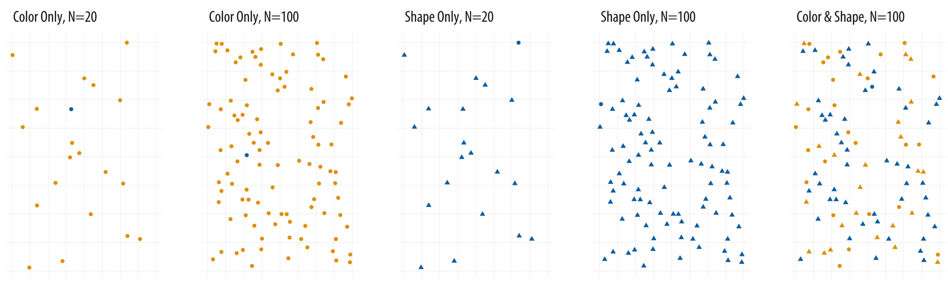
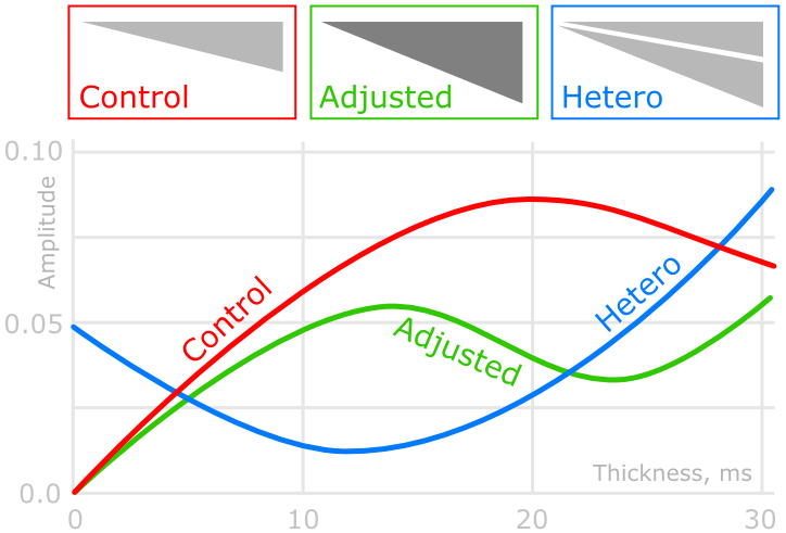
Color better than shape.
Kieran Healy, "Data Vizualization: a Practical Introduction."
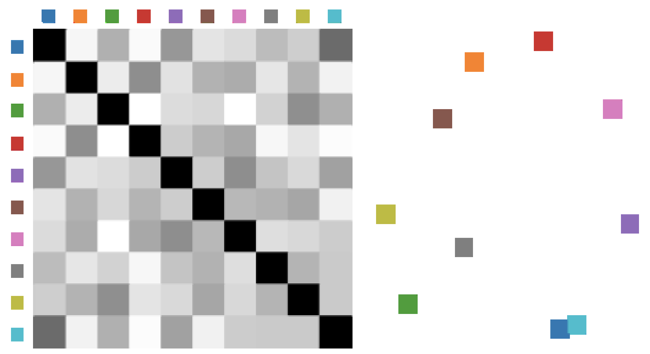
Which colors play nicely together?
Demiralp et al. (2014), "Learning Perceptual Kernels for Vizualization Design."
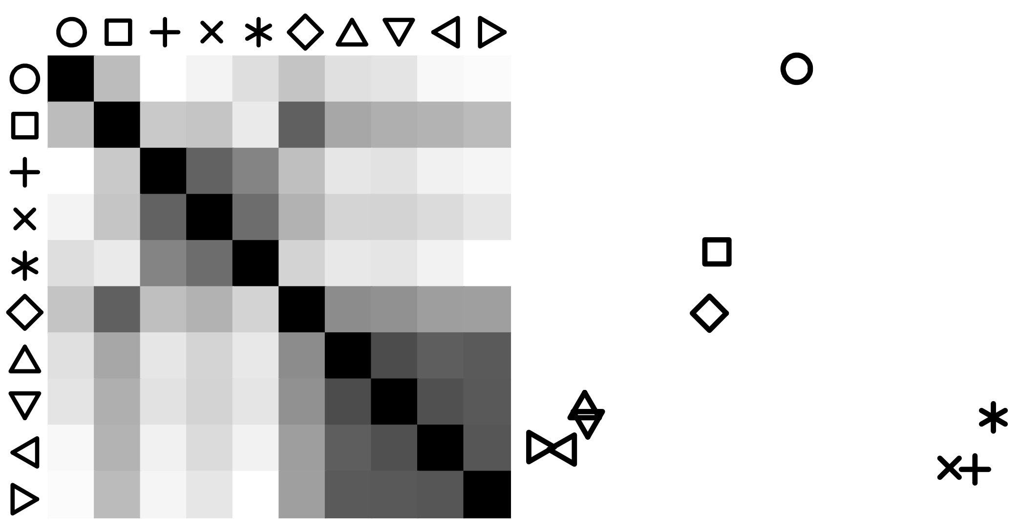
Which shapes play nicely together?
Demiralp et al. (2014), "Learning Perceptual Kernels for Vizualization Design."
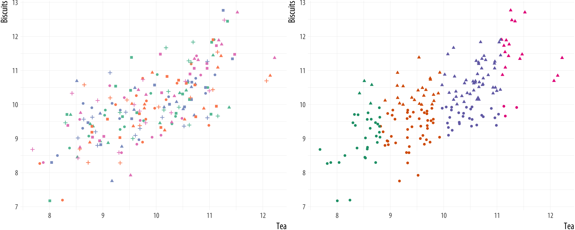
Distinguishability falls off a cliff unless data is highly structured.
Kieran Healy, "Data Vizualization: a Practical Introduction."
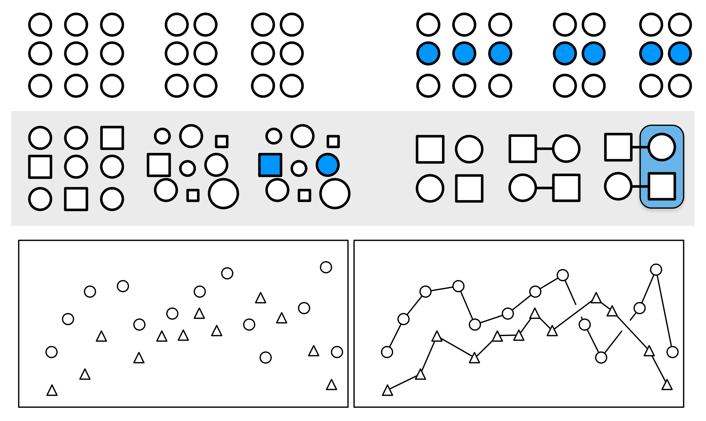
- Proximity: Things that are spatially near to one another seem to be related.
- Similarity: Things that look alike seem to be related.
- Connection: Things that are visually tied to one another seem to be related.
- Continuity: Partially hidden objects are completed into familiar shapes.
- Closure: Incomplete shapes are perceived as complete.
- Figure and Ground: Visual elements are taken to be either in the foreground or the background.
- Common Fate: Elements sharing a direction of movement are perceived as a unit.
Kieran Healy, "Data Vizualization: a Practical Introduction."
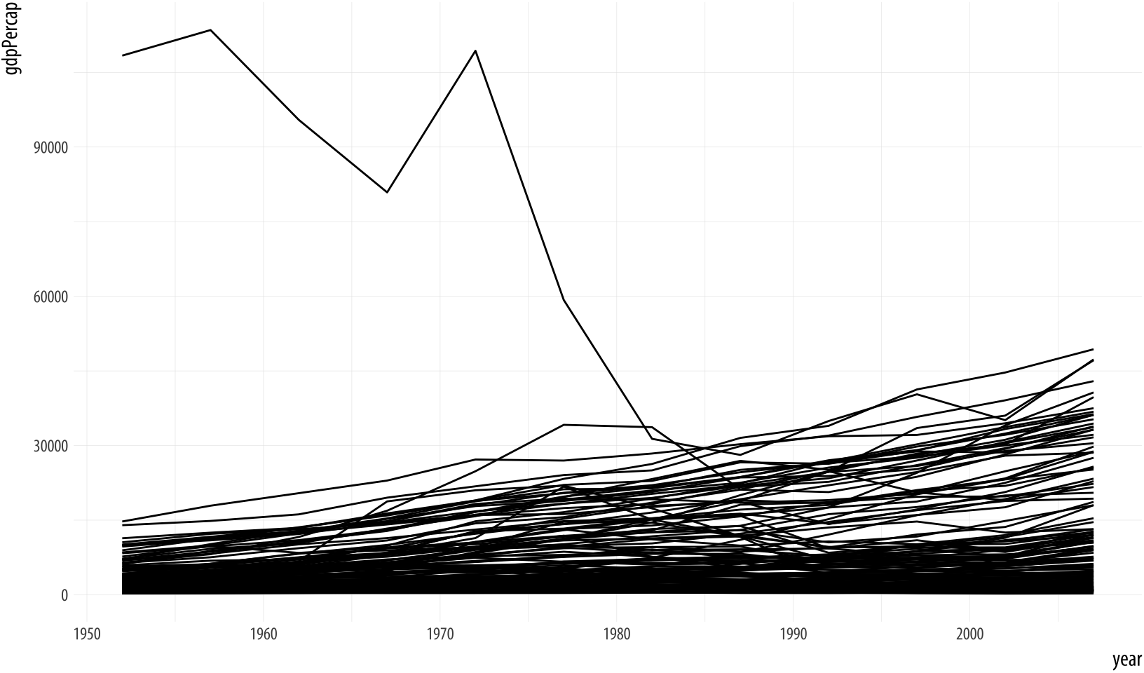
Don't need to show all data in one panel.
Kieran Healy, "Data Vizualization: a Practical Introduction."
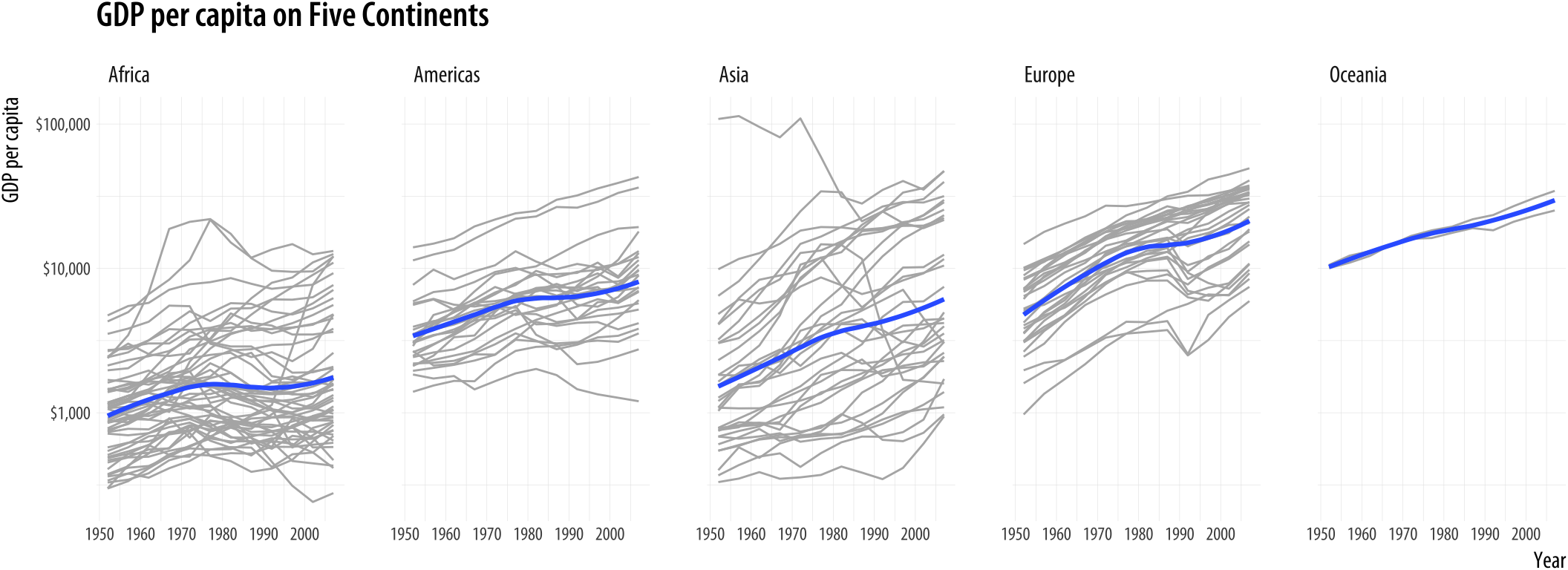
Multiple panels add structure.
Kieran Healy, "Data Vizualization: a Practical Introduction."
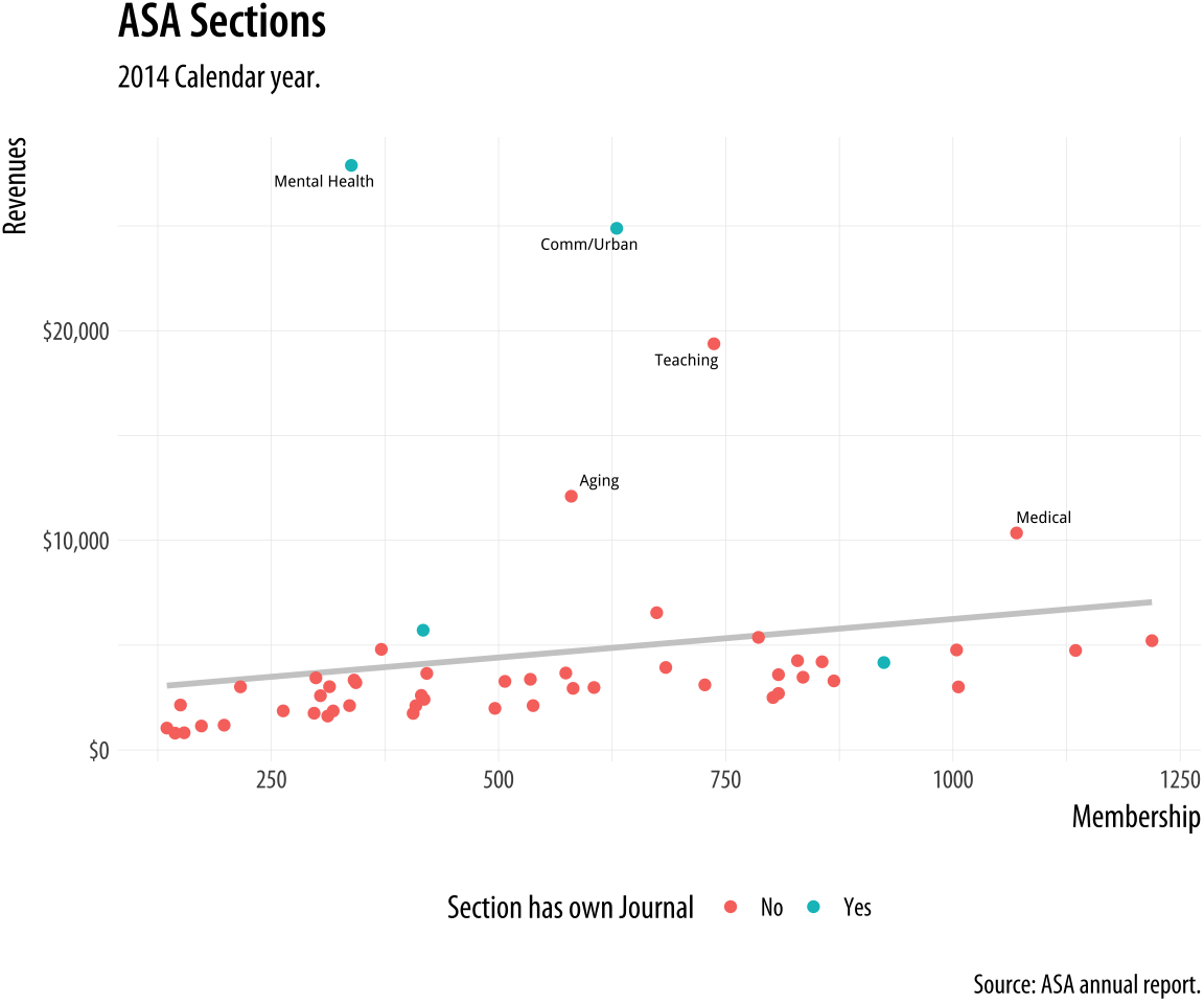
Annotate outliers.
Kieran Healy, "Data Vizualization: a Practical Introduction."
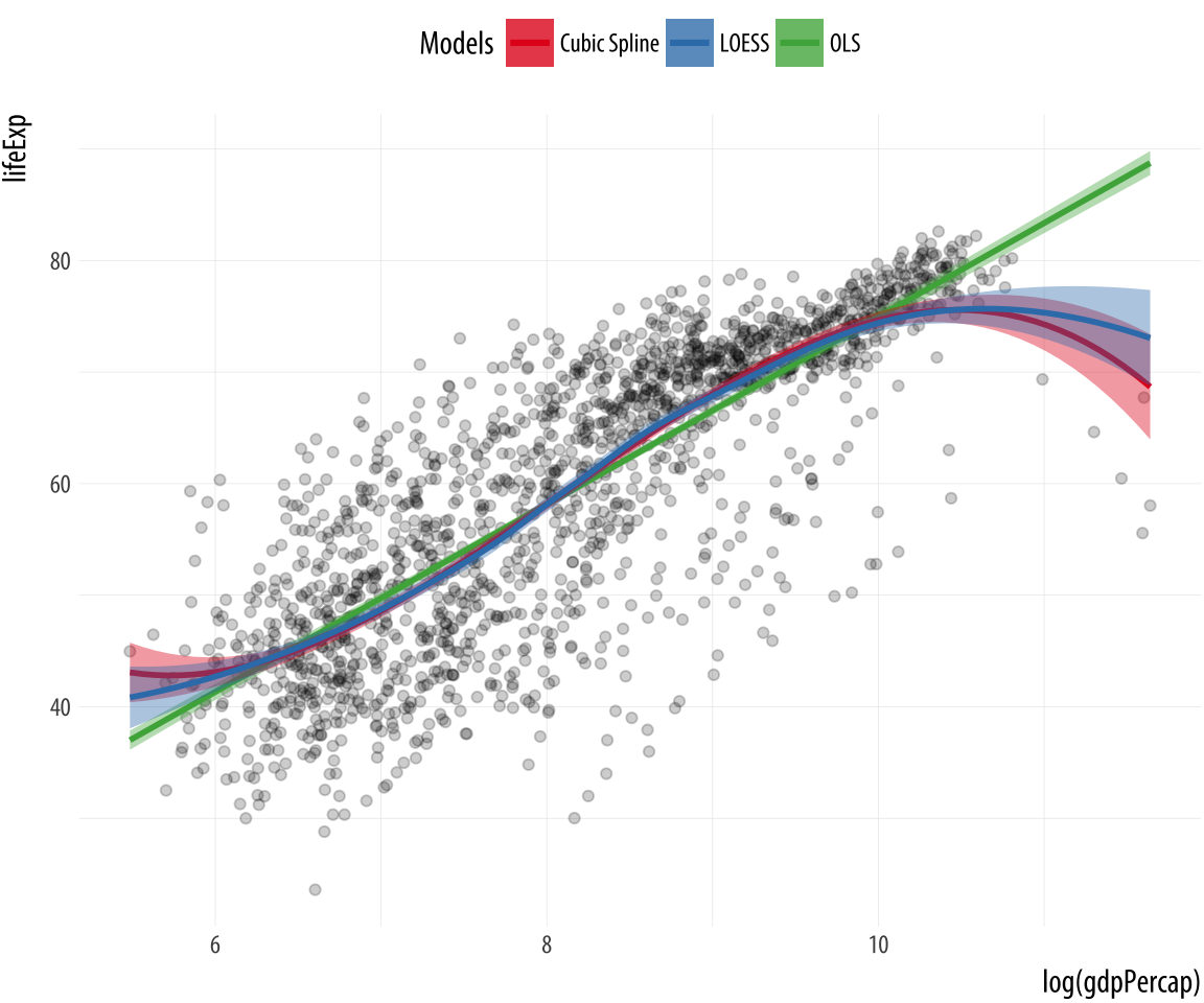
Alpha for overlapping points.
Kieran Healy, "Data Vizualization: a Practical Introduction."
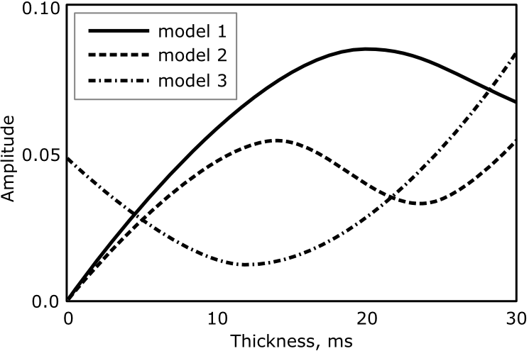
Basic Legend.
More intuitive.
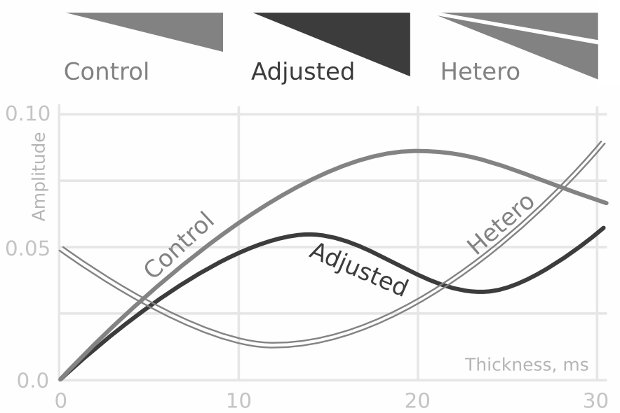
Black and white option.
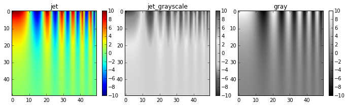
Don't use jet.
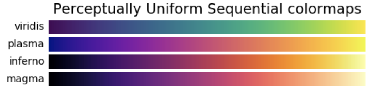
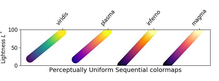
Sequential Colormaps
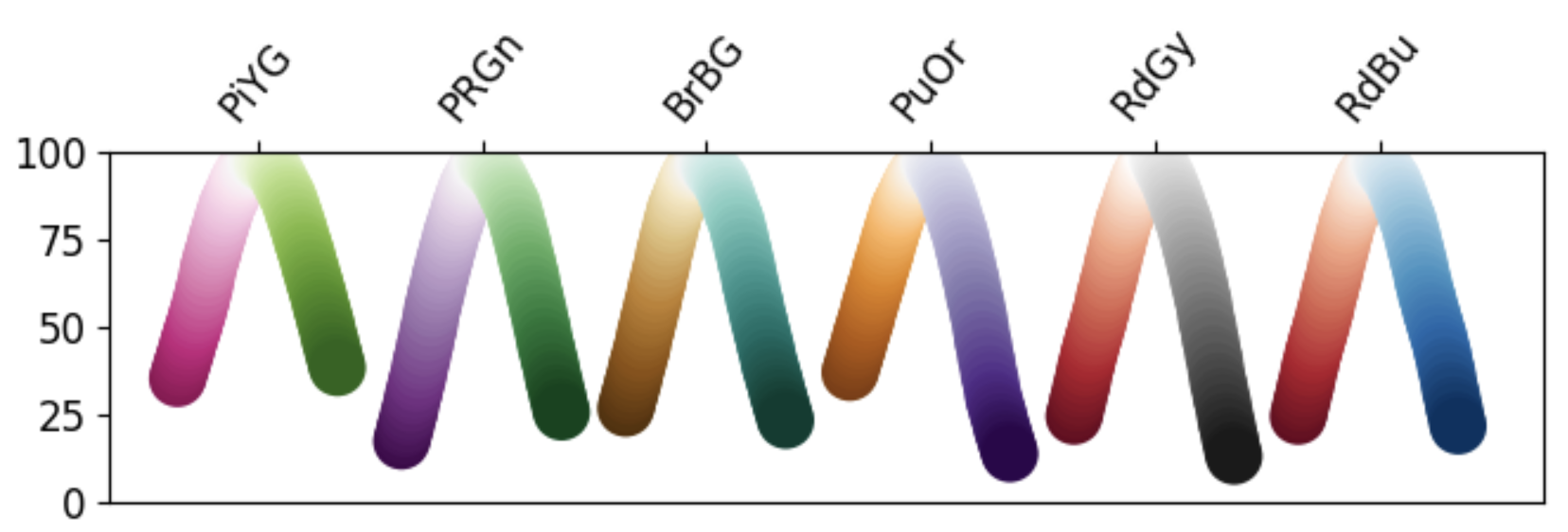
Diverging Colormaps
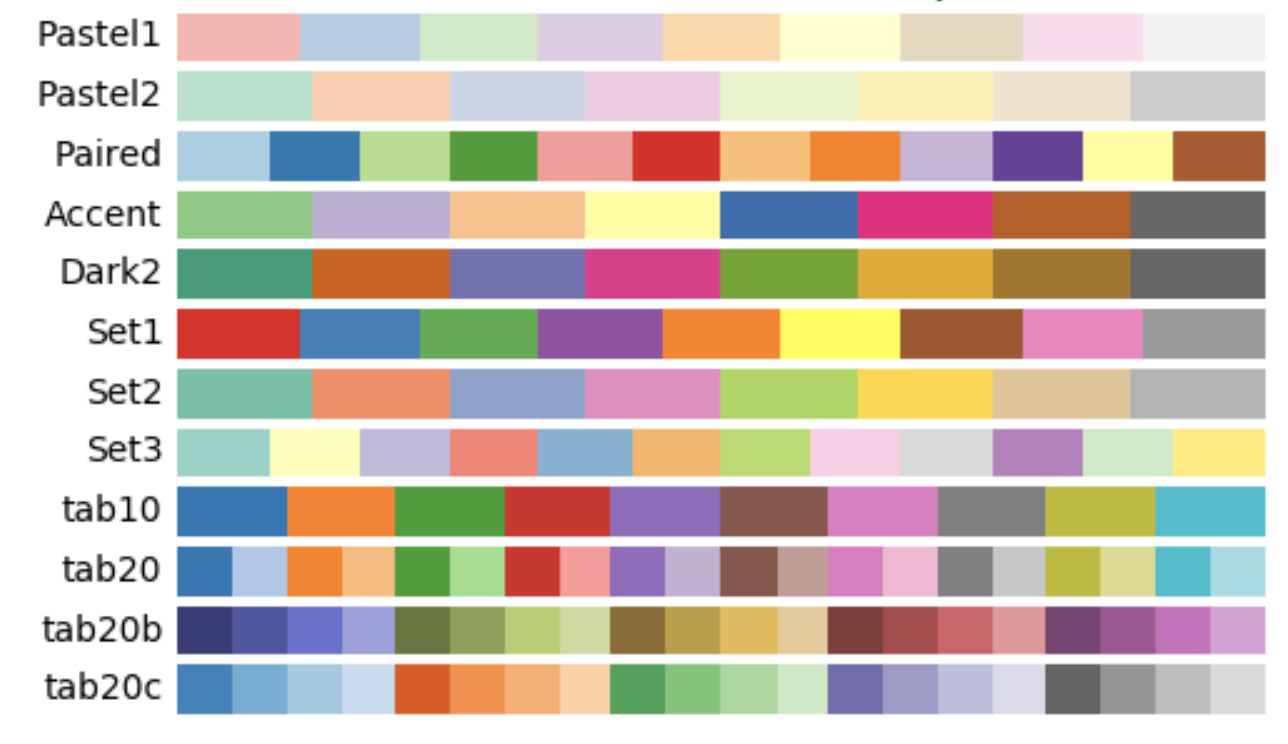
Qualitative Colormaps

Cyclic Colormaps
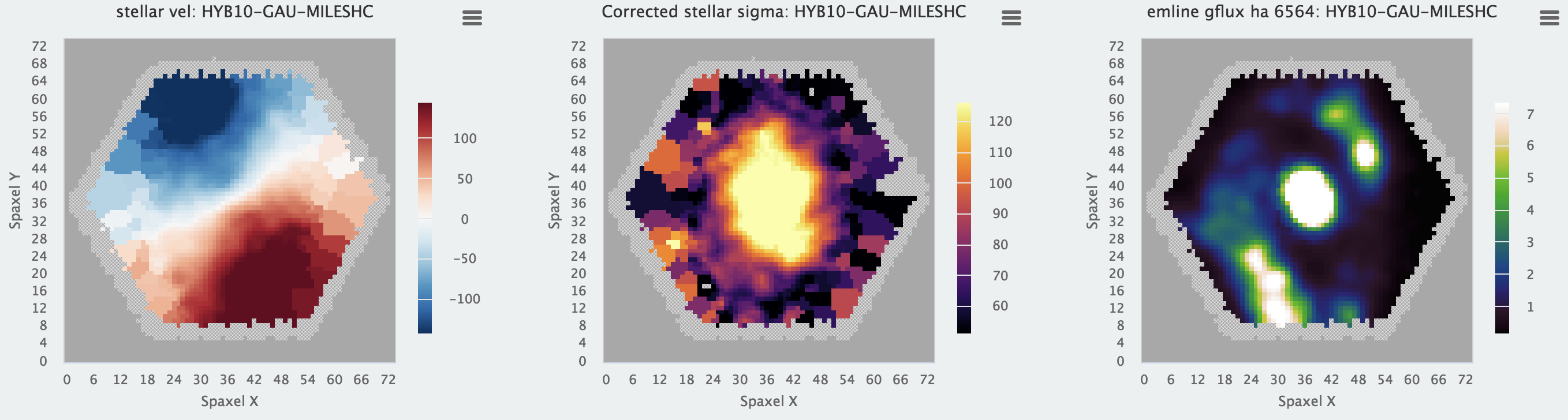
Colormaps in the wild.
Don't make me think!
Take advantage of human perception.